Amazon Web Services (AWS)

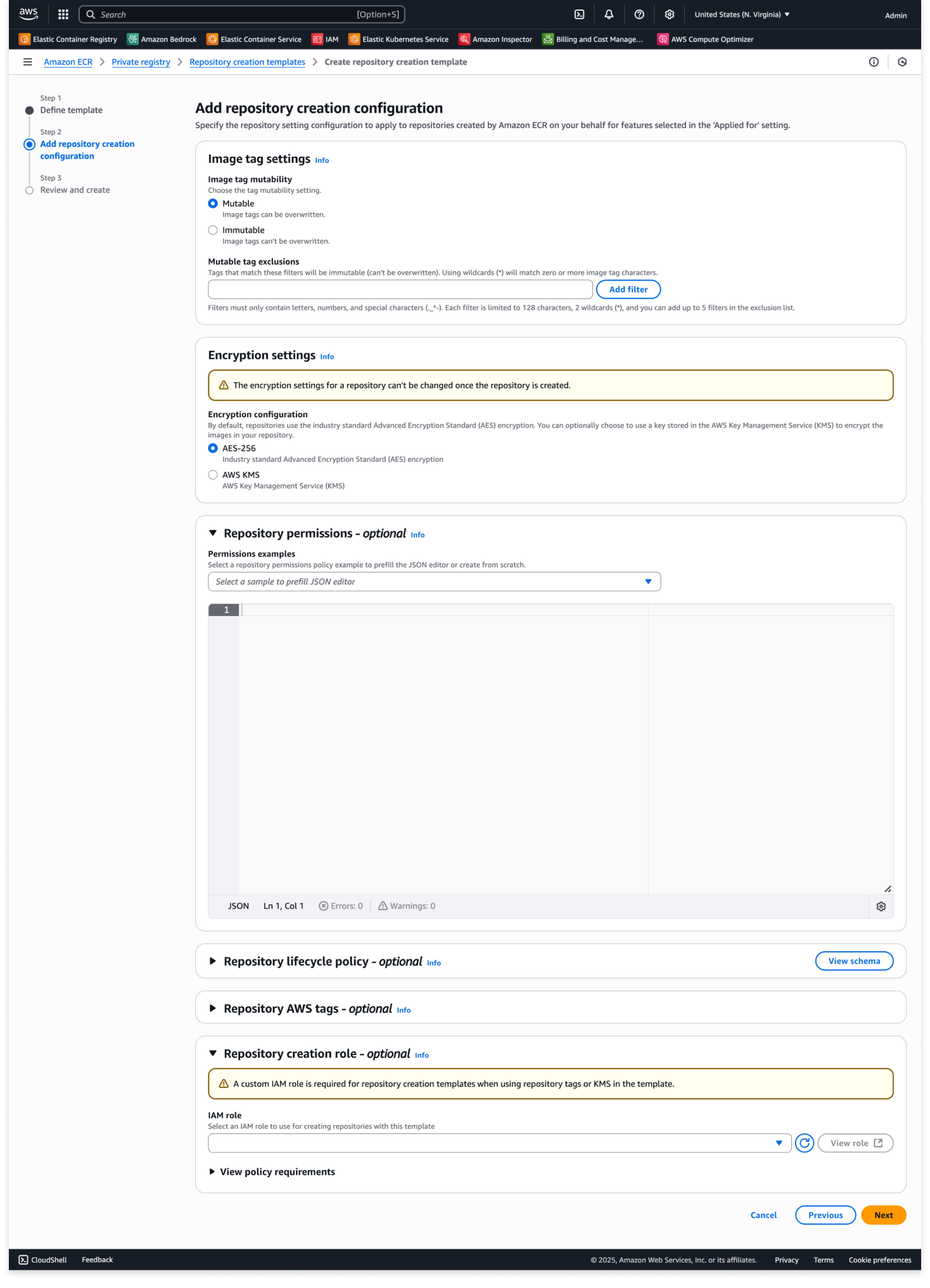
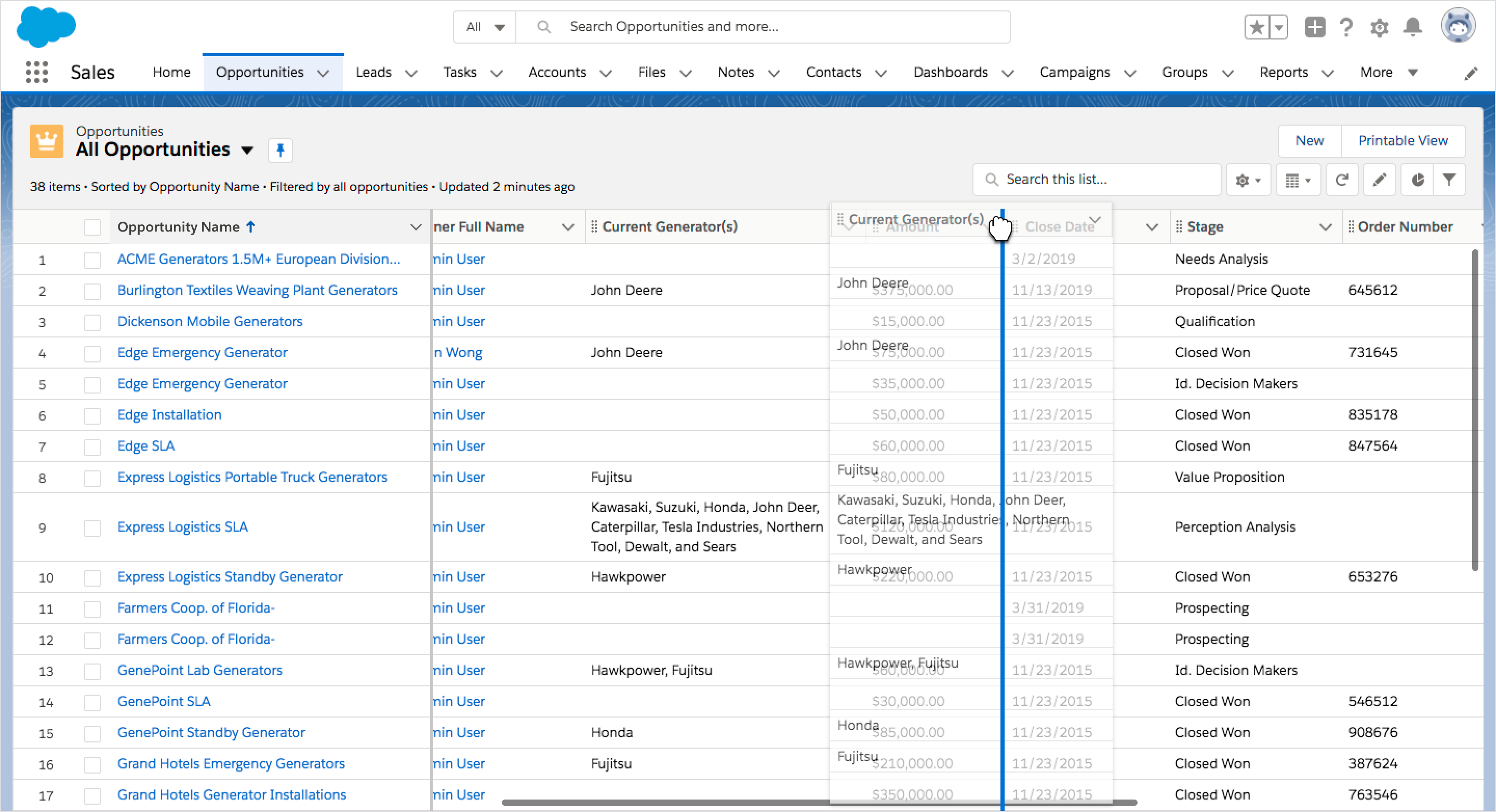
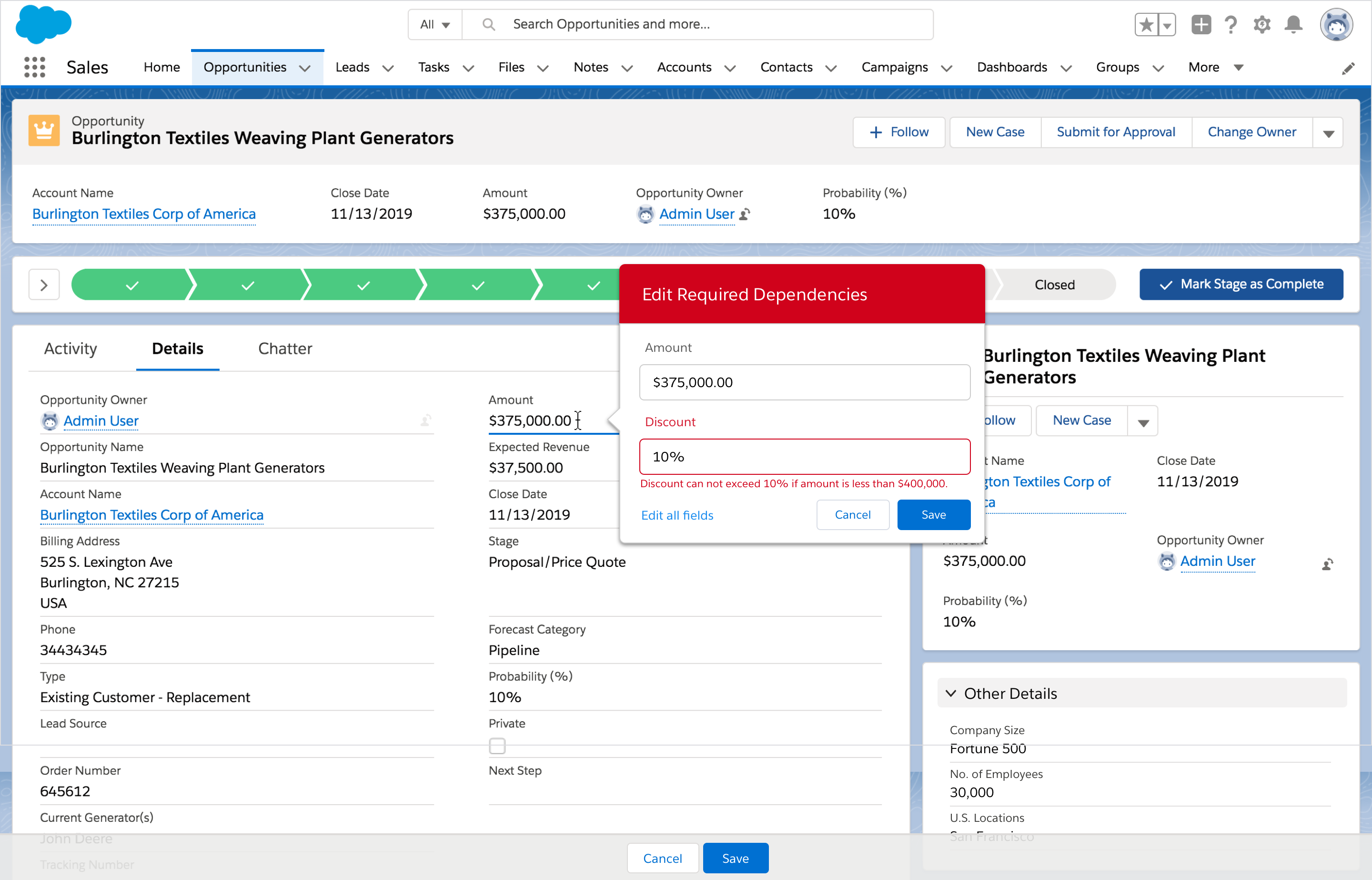
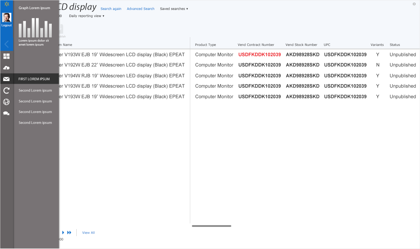
REPOSITORY CREATION TEMPLATES

I led the UX design for repository creation templates, focusing on implementing an intuitive template system that combines several workflows into one. The project began after observing customers struggling with repetitive manual configurations and inconsistent settings across repositories through ECR services like create-on-push, replication, and pull-through cache. Our solution introduced a template-based approach that enables users to save and reuse common repository configurations and permissions, while also incorporating standardized security scanning settings, tag immutability rules, and lifecycle policies. The template system was designed to support automatic repository creation with pre-configured best practices for various deployment scenarios. The impact resulted in eliminating the need for manual repository creation and configuration, ultimately enhancing enterprise workflows and environments where standardization and security compliance are crucial.

My role
As UX lead, I facilitated ideation workshops focused on future-proofing our design approach. These sessions helped the team predict evolving customer workflows. They ensured we created an expandable feature set. This set scales with customer needs rather than becoming limited by first design constraints. I designed the feature while working closely with engineers and stakeholders to develop the core functionality and experience. Through rite-testing and iterative feedback, I helped shape the product positioning to strengthen its impact upon release.

Project challenges
– Consolidate multiple configuration workflows into a cohesive experience
– Resolve nomenclature complexity for user-facing features
– Ensure design extensibility for future use cases
– Align design solutions with emerging technical architecture
– Optimize user validation process within resource limitations

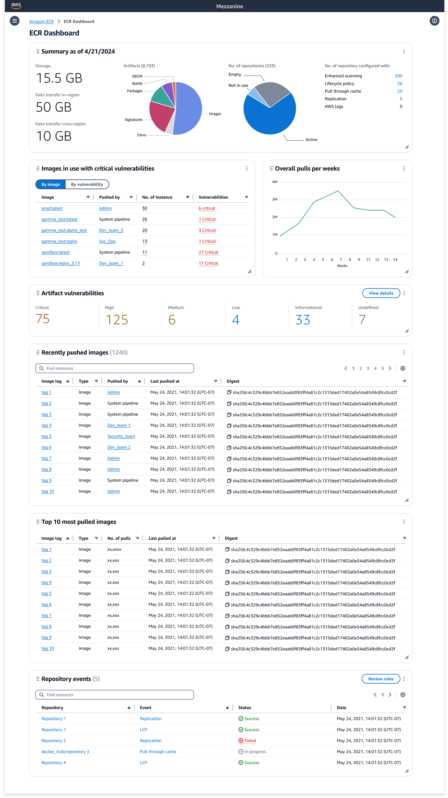
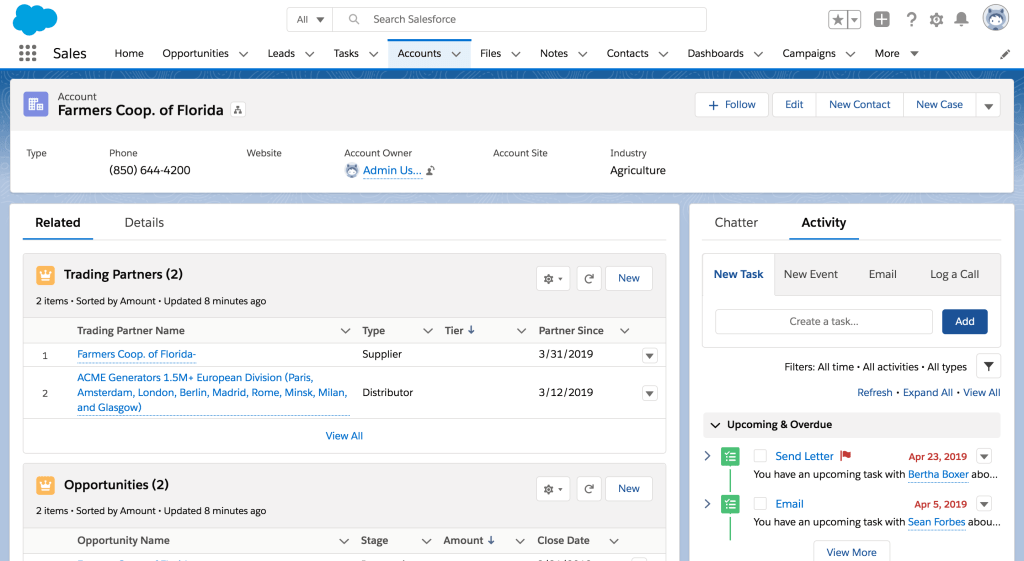
ELASTIC CONTAINER REGISTRY DASHBOARD (CONCEPT)

I led the exploration of a comprehensive dashboard solution for Amazon Elastic Container Registry (ECR), addressing user feedback about lacking a holistic view of their registry. Through close collaboration with engineering teams, we evaluated the technical feasibility of various dashboard components and their implementation complexity. The research phase included extensive user interviews to confirm our direction, concept testing to refine the approach, and MaxDiff studies to prioritize features based on user value. This systematic approach to understanding user needs and technical constraints helped us define a viable dashboard solution that garnered significant interest from product management. Our research revealed key opportunities for providing users with meaningful insights into their repository health, usage patterns, and security posture across their entire registry.

My role
As UX lead, I drove the initiative to develop an ECR dashboard from concept to proposal. I gathered use cases through customer interviews and defined the user experience through iterative design. Through close collaboration with engineering teams, I validated both user needs and technical feasibility. I developed comprehensive strategy documents that effectively communicated the vision during roadmap planning sessions, successfully sparking discussions and future interest in resource allocation for the project.

Project challenges
– Proactively championed initiative from UX discovery to product adoption, building compelling evidence through user research
– Evaluated engineering complexity and implementation feasibility of proposed dashboard components
– Prioritized features by analyzing customer value against development effort through MaxDiff studies
– Navigated resource constraints within annual planning cycle while competing with other strategic initiatives
– Conducted focused user research despite limited testing resources and participant availability

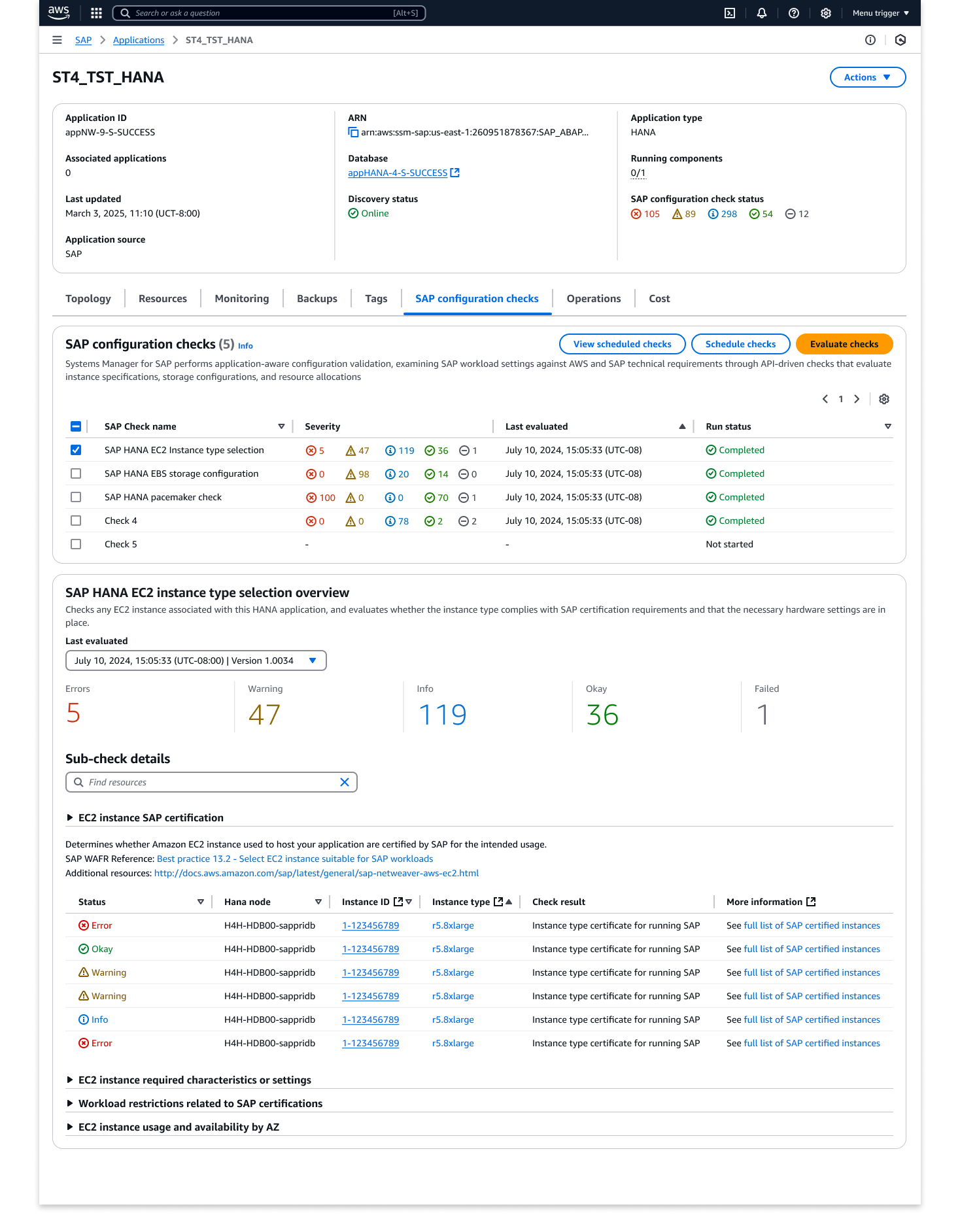
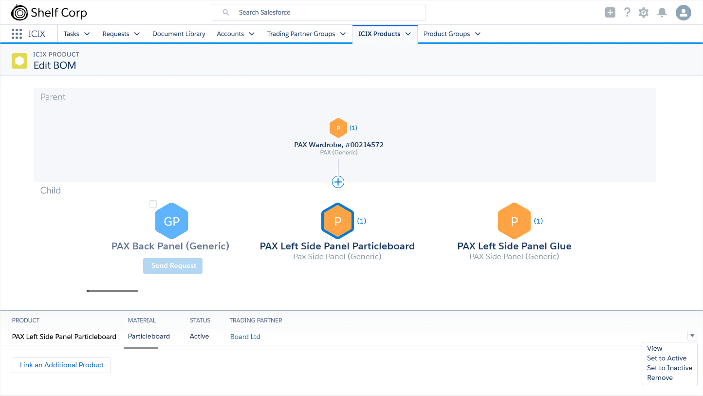
SAP ON AWS CONSOLE EXPERIENCE

As UX lead for SAP on AWS, I drove the north star vision for a new console experience through structured ideation sessions with key stakeholders. These collaborative sessions united diverse perspectives from SAP specialists, solutions architects, and cloud infrastructure teams to build a comprehensive knowledge base of SAP on AWS workflows. I facilitated workshops that established clear user personas – from SAP Basis administrators to cloud architects – and defined their unique needs and pain points. Working with stakeholders, I developed design principles that balanced SAP’s complexity with AWS’s cloud-native patterns, creating a framework for intuitive SAP deployment and management.

This foundational work informed our approach to simplifying complex SAP workflows and guided the development of low-fidelity concepts. Through iterative feedback sessions with subject matter experts and potential users, we refined these concepts into an MVP that focused on critical SAP deployment and management scenarios. The resulting console experience demonstrated how we could streamline SAP on AWS operations while maintaining the robustness required for enterprise workloads.

My role
As UX lead, I orchestrated the strategic direction for SAP on AWS’s console experience through structured ideation sessions with cross-functional teams. I managed relationships across SAP specialists, solutions architects, and cloud teams while leading workshops to develop user personas and design principles. Through stakeholder management and continuous feedback loops, I guided the team from discovery to an MVP that balanced user needs with technical constraints, setting the foundation for a streamlined SAP on AWS console experience.

Project challenges
– Led UX integration into a team with limited prior design collaboration experience
– Stepped into strategic leadership role during critical stakeholder transition
– Managed rapid design iterations within compressed timeline
– Adapted design approach to align with emerging technical architecture

Salesforce

Salesforce – Densify

After Salesforce’s new Lightning UI was introduced, feedback from our users showed that excessive white space was our #1 blocker to user adoption. Users needed a way to see more information within the first screen to maintain productivity. Working with cross-cloud Product and UX partners across the entire Product organization, a systematic approach was established to add a densification view across the app. Leveraging our design system, exploring numerous density options, and through user testing, we were able to execute an organization-wide change with minimal effort and impact on our partners. As a result, white space was no longer an adoption barrier to Lightning, contributing to reaching our FY21 six million monthly active users’ goal.

My Role
As Principal UX lead, I led cross-cloud effort to provide a viable solution to executive stakeholders, drive alignment and commitment from various Product/UX/Engineering owners, and execute a solution within a single release.

Project challenges
– Inconsistent code execution across components
– Large scale change
– Multiple executive stakeholders
– Keep to a minimum, resource impact across teams
– Coordination between different Product and UX teams
– Short release cycle
– No historical knowledge of site

View Case Study

Salesforce – Mobile Application

Launching an improved version of our enterprise mobile app was one of Salesforce’s biggest undertaking. A new design foundation had to be built for our mobile framework. Everything had to be redefined to build an application that could evolve with our users and the demands of an enterprise platform. This resulted in a highly celebrated, world-class mobile experience by our users.

My Role
As Principal UX Designer, I led the mobile redesign efforts for Records and Object list page. Working closely with the Mobile and Lightning design teams, we established a new set of mobile patterns across the app.

Project challenges
– Mobile patterns were yet to be defined
– Multiple executive stakeholders
– Coordination between different Product and UX teams
– Short release cycle

Salesforce Mobile Opportunity Record Page

Salesforce – Object Home/Lists

Focusing on our top 5 customer feature requests, we created a FY22 vision of Object Home that would enable users to take next best action on a set of records, and bring productivity improvements. New features based on the feedback we received included a Records summary view, column reordering, multi-sort, Rolodex and closing feature gaps between Classic (previous version) and Lightning (new version).

My Role
As Principal UX Designer, I led the effort to address our customers’ highly requested features for FY22.

Project challenges
– Maintain page performance
– Leverage existing architecture
– Minimize UI complexity
– Maintain accessibility compliance

Object Home Record Summary View
Column Freeze + Rolodex
Column Drag and Drop

Salesforce – Inline Edit Reimagined

One of the greatest challenges for the Salesforce app is inline editing. Currently, when a user activates inline editing, instead of a single field becoming editable, all fields become editable. Unlike in other applications, the ability to do inline editing in the Salesforce app becomes very complex, as there are multiple levels of validations that impact the user experience.

We leveraged a new page architecture to paint a new version of inline edit, introduced new features to improve productivity for our users and closer align to expected web-behavior, while maintaining accessibility compliance and complex validation checks.

My Role
As Principal UX Designer, I led the effort to propose an improved version of inline edit in the Salesforce ecosystem, bringing executive leadership and product on board to be added to our FY22 roadmap.

Project challenges
– Complex field validation rules
– Maintain accessibility compliance
– Infrastructure limitations and release cycles

Inline Edit Custom Fields
Inline Edit Multi-Field Updates
Inline Edit Error Handling
Prototype: Inline Edit via a Field
Prototype: Inline Edit via a Global Control

ICIX Network Visualization

ICIX is built on the Salesforce Platform. The ICIX Network is comprised of Trading Partners, Suppliers, and Products; these three key objects are connected through record relationship. Salesforce shows this relationship through the use of related list on a Record. This flat data structure was difficult for our users to understand how their Trading Partners, Suppliers, and Products were connected.

Taking inspiration from structures of chemical compounds, communication networks, word clouds, and depth of field photography, we developed a visualization layer that connected to the Salesforce Record infrastructure to help our users easily see how their Trading Partners, Suppliers, and Products were interconnected. A visual Build of Materials interface was also added to complete the experience.

My Role
As Sr. Director and Lead of the project, I worked in close partnership with our CEO to gain his support of this UX driven initiative and bring this concept to a working prototype to showcase to our biggest customers.

Project challenges
– Complex data structure across different organizations
– Visual library built from scratch
– Deep product and partner relationships
– Complex workflows

ICIX Application for BOM (Build of Material) Construction
Build of Materials Visualization
Trading Partner Node Relationship Visualization (Unselected and Selected states)
Trading Partner Product Search Visualization
Early Proof of Concept of the ICIX Visual Network

ICIX Salesforce Application

The Supply Chain Network is oftentimes plagued with inefficiencies, lack of traceability, and no accountability. At ICIX, we set forth to build a supply chain network on the Salesforce ecosystem that would help solve these issues. Using Salesforce, we could track where a product originated, whether or not it was tested properly, and who it was distributed to. Our customers were able to apply significantly higher safety standards, timely crisis management, and traceability throughout a product’s lifecycle by using our tool. Working closely with Product, Engineering, and the Executive team, we built this new system from the ground up, defining our product strategy, product experience, and design thinking culture. We established personas and mental models to help define our four unique apps (Business Relationship Manager, Product Relationship Manager, Product Test, and Form Builder). We extended and adapted the Salesforce Lighting Design system to seamlessly integrate our custom app with standard Salesforce functionality.

ICIX Trading Partner Mental Model
ICIX Application Task Component Pattern
Testing Documentation Comment/History Tracking
Product Lifecycle Planning Table

Apttus

At Apttus, I was given the opportunity to elevate the overall user experience within Apttus’s core product offerings. I built and led on-shore and offshore UX teams, which increased UX throughput by 700%. We enhanced existing product offerings and Sales demos, and established a new UI language and vision of Apttus’s core product offerings. My team also developed and established user personas to help drive product requirements and a user-centered design approach.

Configure, Price, Quote Mobile UI
Configure, Price, Quote on Top of Salesforce Platform
Promotion Manager Built on the Salesforce Platform

Walmart Labs

At Walmart, I defined Walmart.com’s new Experience Management System and next generation global presentation platform, allowing international affiliates to quickly stand up sites with minimal effort. This resulted in a unified user experience across various Walmart holdings, regardless of location.

Design Component System Diagram
Site Serving Infrastructure Diagram
CSS Theming Structure Diagram
Marketing Product UI Concept – Search
Marketing Product UI Concept – Search Results

Walmart China

Our goal was to build a site that was on par or ahead of the local competition, one that quickly adjusted to the needs of the market, while leveraging the Walmart brand with consumers — we wanted our site to be the “go-to” for their daily needs. Our challenge was, how could we be seen as a leader in this space where other US companies have failed?

View Case Study

Walmart China Homepage